Corporate Website / Healthcare IT
CuraTech
Corporate Site
01/Overview
Overview
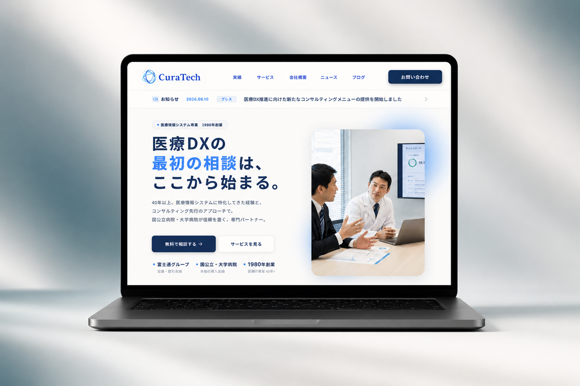
医療システムを提供する企業のコーポレートサイトを対象に、情報設計とUIの改善を目的として取り組んだリデザインプロジェクトです。
専門性の高いサービスを、病院・クリニックの意思決定者にも直感的に理解できる情報設計へ再構築し、「信頼性」と「分かりやすさ」を両立したUIを目指しました。
A redesign project for a healthcare IT company website, focused on improving the information architecture and user interface.
The site was restructured to help hospital and clinic decision-makers understand complex services more intuitively, while balancing clarity with professional credibility.
Project Goals
-
 医療サービスへの理解を深める情報設計
Improve understanding of healthcare IT services
医療サービスへの理解を深める情報設計
Improve understanding of healthcare IT services
-
問い合わせにつながる導線の最適化
Optimize the path toward inquiry
-
医療IT企業としての信頼性を視覚的に強化
Strengthen trust through visual communication
02/Challenge
Challenge
-

専門性の高い情報が理解しづらい
Complex information was difficult to understand
-
サービスの強みや導入メリットが伝わりにくい
Service value and implementation benefits were unclear
-
問い合わせまでの導線が分散している
The path toward inquiry was fragmented
Background
医療機関の担当者は限られた時間の中で複数のサービスを比較検討しています。一方で、医療システムは専門用語が多く、ITリテラシーにも個人差があるため、情報が複雑になるほど意思決定の負担が大きくなります。そこで、専門性を維持しながらも、誰でも理解しやすい情報構造とUI設計を目指しました。
Healthcare professionals often compare multiple services within a limited amount of time. Because medical systems involve highly technical terminology and users have varying levels of digital literacy, complex information increases the burden of decision-making. The challenge was to preserve professional expertise while creating an information structure and interface that remained clear and accessible.
03/Approach
Approach
専門性と分かりやすさを両立し、安心して相談できる体験を設計しました。
Designed an experience that balances expertise with clarity while building confidence toward inquiry.

導線設計
Conversion Flow
CTAを適切なタイミングへ配置し、問い合わせまでの流れを最適化
Placed CTAs strategically for a clear path toward inquiry


情報設計
Information Architecture
重要情報を優先し、短時間でも理解しやすい構成に整理
Prioritized key information for quick comprehension

ビジュアル設計
Visual Design
安心感を与えるミニマルなビジュアルデザインを採用
Applied a minimal, trustworthy visual system
04/Design Solution
Design Solution
成果につながるよう、以下のポイントを意識してデザインしました。
The design focused on the following points to support clear communication and user action.

情報整理
Information Structure
情報をカテゴリごとに整理し、必要な情報へ素早くアクセスできる構成に改善。
Grouped content by category for quick access to key information.

ビジュアル設計
Trust-focused Visual Design
ネイビーベースの配色と読みやすいタイポグラフィを採用し、信頼感のあるブランドイメージを構築。
Navy palette and clean typography for a credible brand image.

導線強化
Conversion Flow
ユーザーの不安を解消しながら、問い合わせまで自然に誘導する導線を設計。
Reduced concerns and guided users naturally toward inquiry.
PC

05/Outcome
Outcome
サービス価値を直感的に伝え、導入検討をスムーズに進める情報体験を実現。
Created a clearer information experience that communicates service value and supports smoother decision-making.
-
医療IT企業としてのブランド価値を向上
Strengthened brand credibility as a healthcare IT company
-
導入検討時の心理的負担を軽減
Reduced uncertainty during service evaluation
-
サービス内容の理解を促進
Improved understanding of the service offering
Contact
Let's talk
フリーランス案件のご相談も承っております。
お気軽にご連絡ください。
Available for freelance projects.
Feel free to reach out anytime.