Hair Salon Website / UX Redesign
LUNÉ
Hair Salon
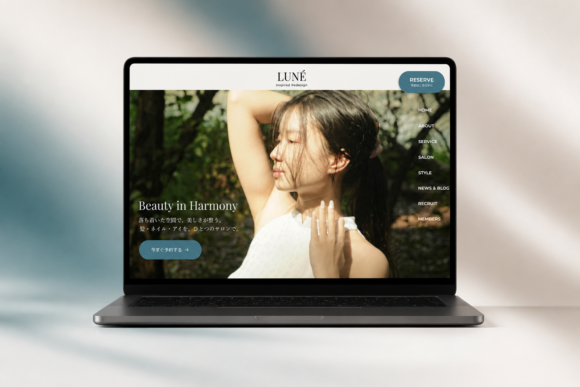
01/Overview
Overview
ヘアサロンのブランドイメージを再構築し、予約導線と情報設計を改善することを目的としたWebサイトリデザイン。
美容業界らしい上質な世界観を保ちながら、ユーザーが直感的に情報へアクセスできる体験を設計した。
A website redesign aimed at rebuilding the hair salon's brand image and improving booking flow and information design.
Designed to maintain the premium aesthetic of the beauty industry while enabling users to intuitively access information.
Project Goals
-
 予約までの導線を最適化し、ユーザー行動をスムーズにする
Optimize the booking flow for smooth user behavior
予約までの導線を最適化し、ユーザー行動をスムーズにする
Optimize the booking flow for smooth user behavior
-
サロンのブランドイメージと世界観を強化
Strengthen the salon's brand image and identity
-
初めてのユーザーでも安心して予約できる、シンプルで分かりやすい導線設計
Design a simple and clear flow so first-time users can book with confidence
02/Challenge
Challenge
-

情報整理が不十分で、必要な情報に辿り着きづらい
Poor information organization makes it hard to find key content
-
予約導線が分散し、アクション導線が弱い
Scattered booking entry points result in a weak call-to-action flow
-
ブランドの上質感や世界観が十分に伝わっていない
The brand's premium quality and identity are not communicated effectively
Background
既存サイトは情報量が多く、視線誘導や導線設計が整理されていなかった。特にモバイル閲覧時に可読性と操作性に課題があり、ブランド体験と予約体験の両面で改善が必要だった。
The existing site was information-heavy, with poorly organized visual flow and navigation. Readability and usability issues were especially evident on mobile, requiring improvements to both brand experience and booking experience.
03/Approach
Approach
情報設計とUI設計を見直し、ブランド体験と予約導線を両立する設計を再構築。
Rethought information and UI design to rebuild a structure balancing brand experience and booking flow.

導線最適化
Flow Optimization
予約CTAを整理し、自然なユーザーフローを設計
Streamlined booking CTAs to design a natural user flow


情報設計
Information Design
必要情報を優先度ごとに再構築し、視認性を改善
Restructured content by priority to improve visibility

ビジュアル設計
Visual Design
余白とタイポグラフィを活かし、上質感のあるUIを構築
Leveraged whitespace and typography to build a premium UI
04/Design Solution
Design Solution
成果につながるよう、以下のポイントを意識してデザインしました。
The design focused on the following points to drive meaningful outcomes.

ファーストビュー改善
First-View Redesign
ブランドイメージが直感的に伝わるビジュアル設計に刷新
Renewed visual design so brand image is communicated intuitively

ビジュアル設計
Visual Design
上質感と信頼感を両立するトーンでブランド価値を表現
Expressed brand value through a tone balancing premium feel and trustworthiness

予約CTA強化
Booking CTA Enhancement
予約ボタンの配置と優先度を整理し、行動導線を改善
Organized booking button placement and priority to improve action flow
PC

05/Outcome
Outcome
ユーザー体験の向上とブランド価値の強化を通じて、予約行動につながる導線を最適化。
By improving user experience and strengthening brand value, the path leading to booking actions was optimized.
-
必要な情報へ直感的にアクセスできるUXを実現
Achieved a UX where users can intuitively access the information they need
-
ブランドの清潔感・安心感・上質さを強化
Strengthened the brand's cleanliness, trustworthiness, and premium quality
-
自然な予約導線により、予約率向上と新規来店促進をサポート
Natural booking flow supports higher reservation rates and new customer acquisition
Contact
Let's talk
フリーランス案件のご相談も承っております。
お気軽にご連絡ください。
Available for freelance projects.
Feel free to reach out anytime.